INDUSTRY
FINANCE
CUSTOMER
RIDE
EXPERIENCE
DESIGN SYSTEM
TOOL
FIGMA
RIDE Design System
Design System Overview
The Ride Capital design system is a collection of components, color rules and typographic styles created to build consistent, scalable and accessible user interfaces. It ensures visual cohesion across products while speeding up design and development processes. Every UI element follows a unified visual language to deliver a seamless user experience.
Color Key
The color palette is structured based on meaning and function, helping communicate hierarchy, state and intent across the interface:
Neutral: Used for backgrounds, borders and secondary text — providing clarity and structure without dominating.
Informational: Supports informative messages and contextual content.
Secondary: Used for supporting accents and secondary actions.
Primary: The core brand color, reserved for main actions and highlights.
Success / Warning / Danger: Feedback colors used to indicate positive, cautionary and error states within the system.
Typography & Button Variations
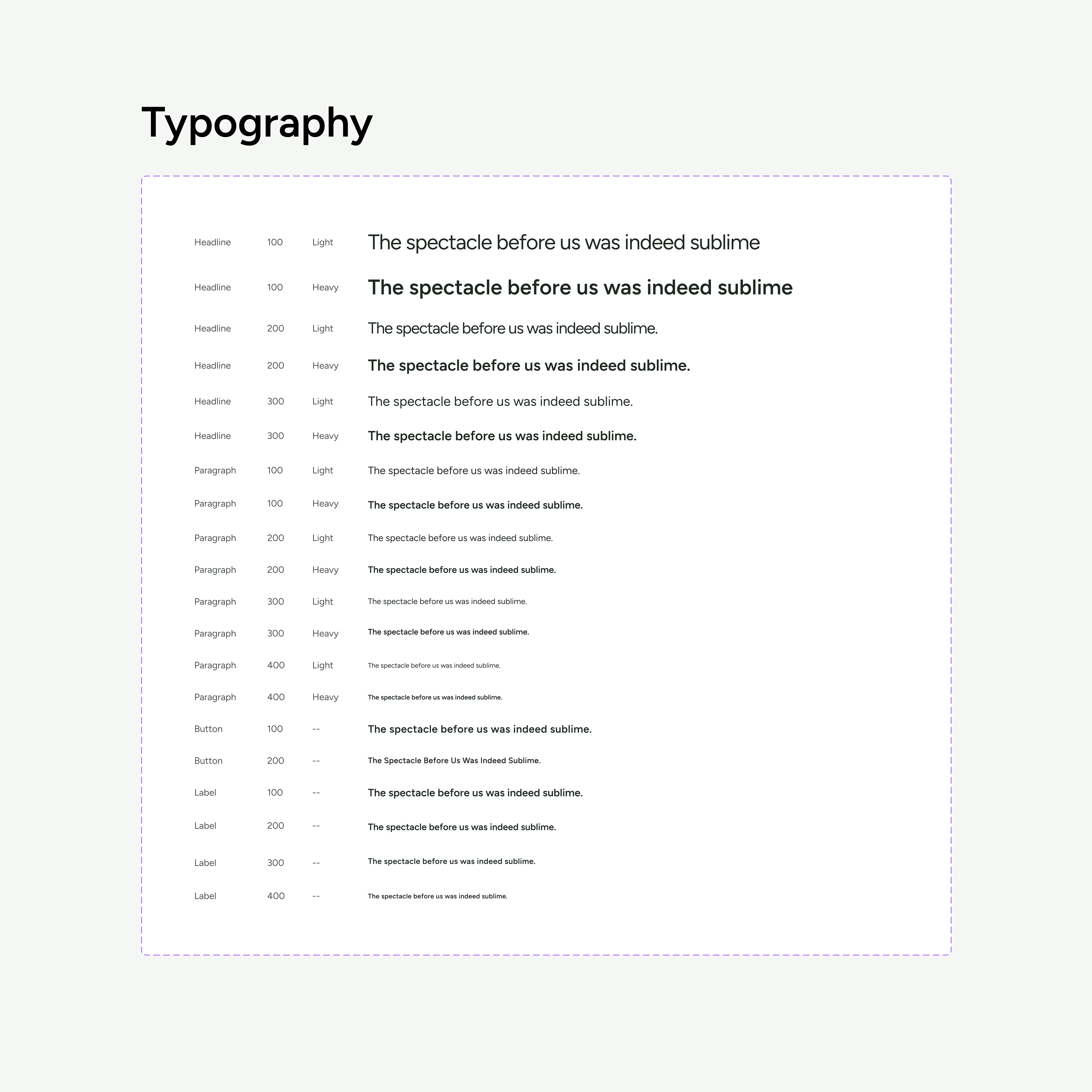
Typography
Typography ensures visual clarity and hierarchy across the interface. The system uses the Figtree type family for its clean, modern and highly readable design — applied consistently in headings, body text and labels to maintain a cohesive visual rhythm.
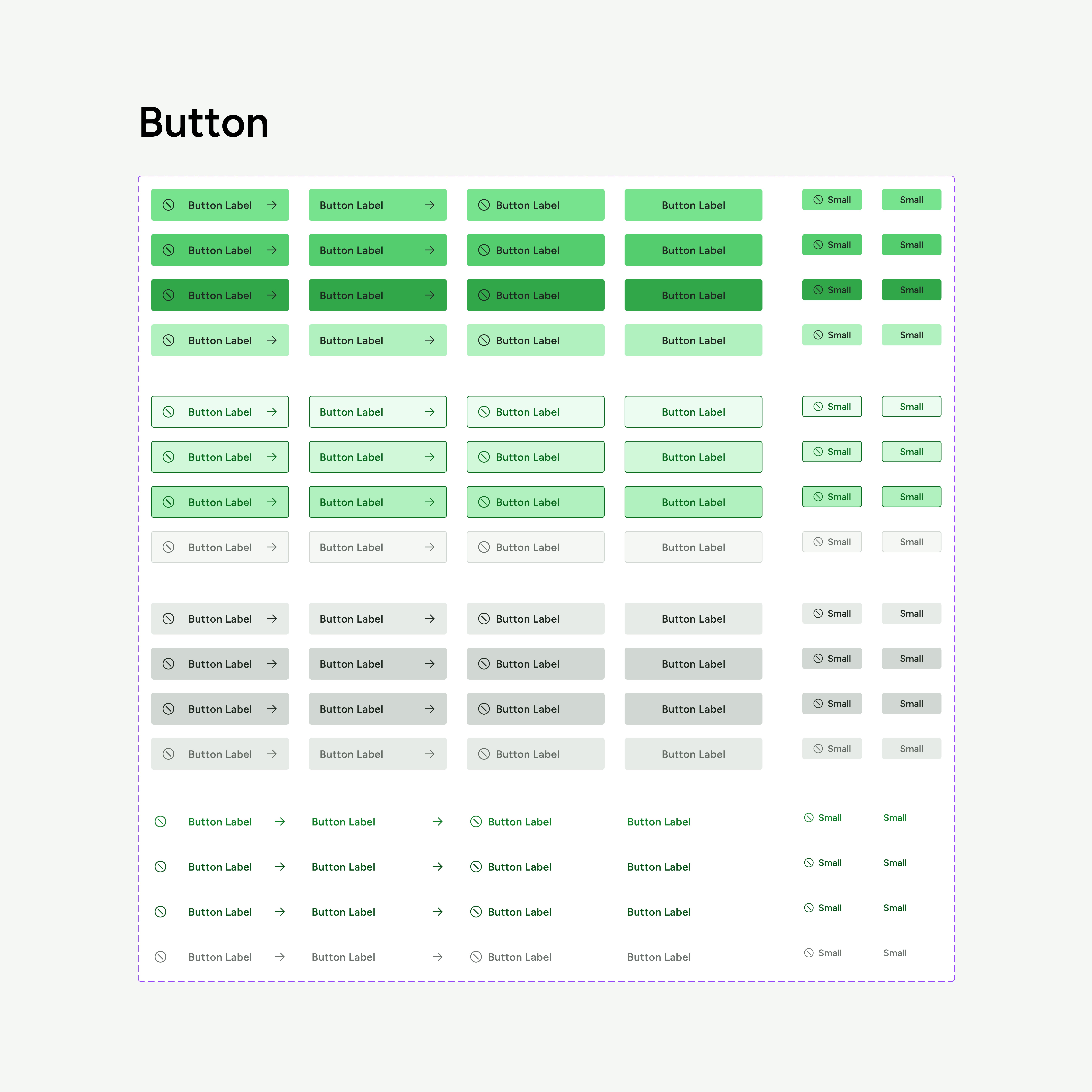
Button Variations
Buttons are key interactive elements that guide user actions. They are offered in various styles (e.g., primary, secondary), sizes and states (default, hover, disabled) to accommodate different use cases while preserving clarity and accessibility.
UI Components
Standardized interface components such as message texts, input fields, single selects, icons and actions create unified interaction patterns. These components support usability and scalability by encouraging consistency throughout the product experience.